Monday, 7 October 2013

Man Ray


"Legendary Photography, painter, and maker of objects and films, Man Ray was on the most versatile and inventive artists of this century. Born in Philadelphia in 1890, he knew the worlds of Greenwich Village in the avant garde era following the 1913 Armory show; Paris in the 1920's and 1930's, where he played a key role in the Dada and Surrealist movements; The Hollywood of the 1940s, where he joined others chased by war from their homes in Europe; and finally,Paris again until his death in 1976."
Man Ray was most well known for his photos of peoples faces or parts of their face. He moved to France and experimented with photography, His experiments with photography included rediscovering how to make "camera-less" pictures, which he called rayographs, also known now as photograms. photogram is an image made without a camera by placing objects onto the surface of a light-sensitive material such as photographic paper and then exposing it to light. The usual result is a negative shadow image that shows variations in tone that depends upon the transparency of the objects used.


I personally don't like Man Ray that much, I find his images can be at times interesting but more often then not i think that these simple, colourless portrait photos and bit dull and lacklustre


Personal Response

First of all I need photos, specifically I need photos of a model    

Friday, 4 October 2013

Colour Splash

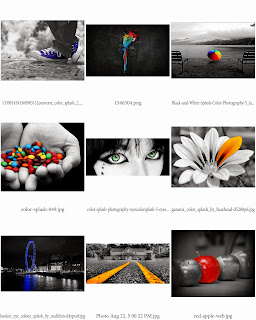
First I need to what a colour splash actually is, so I went to google and sampled some of the photos I thought represented what a colour splash is while also looking aesthetically pleasing, I got a small sample of nine photos I found on google from not particular author.

A colour splash is where an image is turned black & white expect from the focal point of the image which is normally colourful. Now I'm going to have to take some of my own photos and organise them in a contact sheet.

Contact Sheet
Now that I've got my contact sheet, its just a matter of picking the best one for a colour splash.
Then I simply changed it to black and white and tweaked the levels to look nice
with the original on the bottom layer and the black and white version on top i began to use a mixture of  the quick select tool to get rid of the bulk of it and a soft rubber to smooth the edges
and finally i cropped the image down so that the roof and the brick lining frames the trees leaves.
Over all Im quite proud of the final piece because I like the nice autumn leaves, how the tree branch creates a leading line and how the roof and brick wall make a nice frame. if I were to redo this i maybe would have gotten another photo put from a wider angle because the leaves are quite a big part of the image and makes the focal point bigger than Id really like it. 

Wednesday, 2 October 2013

Rule of third


Rule of Third

The rule of thirds is a "rule of thumb" or guideline which applies to the process of composing visual images.The guideline proposes that an image should be imagined as divided into nine equal parts by two equally-spaced horizontal lines and two equally-spaced vertical lines, and that important compositional elements should be placed along these lines or their intersections.


On the left is the orginal version and the right, the cropped version, the main differences are that the cropped version now has a horizontal line going through the horizon now and the Rock face now has two lines intersecting it whereas before it was dead in the middle looking quite boring.

Friday, 27 September 2013

Strips


Sublime and Mundane Strips 


First I got the words sublime, mundane and there defonitions printed onto some transparent paper in a boring font. Then I tore/cut the sheets into different sizes and shapes. Then i attached them a to lamp and took photos close up, I made a sample above of some of the better photos I took.
I start with the raw photo
Then Crop it down to size
Then I added a filter, for this one I made it black and white then edited the levels
Then finally I added post box and used "tilt shift" to create a depth of field 
Heres another one I did but instead of using a post box I made a vignette, ampped up the colours and added an orange filter to the whole thing

Edward Burtynsky

This is a small research I did on the artist "Edward Burtynsky" I briefly talk about why I enjoy his photos, I also sample some of his photos and take a quote from his website talking about his own work. If I were to redo this page I would added a bit more of what I dislike about his work and if possible get a few more photos and make direct comments on each, talking about the techniques he uses and focal points for each one.

Wednesday, 25 September 2013

Mundane

This is one of the title pages for a new topic I'm starting called "Mundane & Sublime"
What i think i did well on this image is capturing mundane life, the boring wooden table with the coffee rings around the carved in "mundane". What i think I could have done better is adding a better font on the words etched around the focal point, if i could re-do this I would take the image home, or outside of the school were downloading fonts is restricted, and make it a rougher try make it really obvious that they are carved into the wood on boring monday morning by an absent minded worker.