Friday, 31 January 2014
Failed experiment
Experiments
NEW IDEA
So After reviewing my final pice i have decided to make a new one, a better one! revolving around this girl Tallulah, a girl pushed to the bitter end by a "Toxic online World" I plan to make typography inspired posters with this girls story as the thing i base everything off of.
Friday, 17 January 2014
Evaluation
My idea
My idea was to design a magazine cover titled mundane and sublime . The magazine will feature some of my work and have bits of text to incise the audience. The general theme was Sublime and Mundane and Typography. I wanted to make sure that the title wasn't just a boring monotone font I downloaded from the internet, because I was doing typography I wanted to take at least a beginners attempt at creating a font of my own or at least customise a basic one. So i got a basic blocky font online and made "slits", for lack of a better word, and divided each letter into chunks, then colouring them using a similar colour scheme to one Brody used. I made this my title for the magazine, it was important for me that the title looked good because otherwise I would just consider that a missed opportunity.
Bad Points:
I Think over all i like my final piece but, it does lack one central eye catching image for m magazine, If I could redo the front cover I would have gotten a photo of someone smiling in the rain without an umbrella the reason for this is that The symbolism would be great for linking sublime and mundane. Rain is normally considered something boring or a bit of a nuisance, a pretty regular occurrence. But when something really amazing happens to you and you are just to over joyed to let anything get to you that is incredibly sublime and the rain being the mundane.
If I had more time I would've liked to actually to make some pages for this magazine, or at least a few sample pages. Maybe feature some of my older work or maybe some of the photos from france, I already have a near compete diary entry from the experience
Something I did not consider in the planning stage was that their is a target audience, I failed to identify who would actually buy this magazine. Passively I've made this for middle aged people who are interested in art but if I was thinking about that at the time i would have made the body text be a bit more relevant to the target audience. I think i got tunnel vision with my topics. In future i will try to consider factors outside of the art world.
Good points:
Ive already said that I personally think my final piece is a success. I think it lends it success to the colour scheme i used, the title is colourful and could be its own thing and everything below the header has a warm feel to it all because of the tone of reds i was using
Another point I think makes my magazine look good is, it has a level of professionalism, it isn't dumbed down to the general public by that I mean their isn't bright colours, massive buzz words or celebrities taking up the entire cover. Its very clean cut, simple and atheistically pleasing, to me at least.
What didn't work? and what I changed
In the beginning i was going to make an entire magazine but due to time constraints I was unable to do the full thing. If I had maybe a week to work on this project I would've made a separate page for each artist and theme used to create the front cover.
When looking at the "blue planet" for inspiration they used a skyline for one of their backgrounds and I thought at east the concept was good but when i tried something similar with space I found it was just to dull and boring, even though that would link with mundane and sublime I thought it just took to much away from the cover so instead I made a more suitable background that linked with my personal topic of Typography with a wall of test and simple layer masking, although later I also changed that so it was clearer, I am much happier with version two because its simple and I personally think it looks much better
Development
 |
| I started with a basic blocky font i found online |
 |
| Then I began to make slits in the letters |
 |
| Then I added a basic grey background, After all the letters and by modified i began to colour them in a similar fashion Brody uses |
 |
| I didn't like how light the image was becoming so I made an inverted vignette to break the background up a little and make it darker. |
 |
| The background was still very plain so I got an temporary image to work with |
 |
| Then i added a motion blur to the top and bottom of the background to create a focal point |
 |
| Then I added a proper divider for the header and some more content for the magazine |
 |
| I started working on a creating a mask over the wall of text. |
 |
| Now I wanted it to feel more like a magazine rather than just a sheet, so i added a barcode and the body text to give the authentic magazine feel. |
 |
| I thought the original text on the body text was, again, irrelevant to sublime and mundane and was altogether a bit to light hearted. So to remedy this made a few minor changes to the text. |
Plan
Overall Idea
My general idea is to create a magazine titled "sublime and mundane" the front cover will feature my work and the contents will all link with sublime and mundane & typography. By the end of the first day I aim to have at least a basic back ground that I'm happy with. By the end of the second day I want all the content to be filled in and the back cover completed. I found this idea through my artist Neville Brody, I thought his work would look really on a magazine, so I created work inspired by him and formed the magazine idea around it.
Potential ideas
- I may have on each page a theme, maybe artist or art style
- Look at the schools own magazine "blue planet" and draw inspiration from it.
- Make a QR code for my magazine that leads to my blog or website
Changes
I have chosen not to do a massive amount of contents inside the magazine due to time constraints. Instead I'm just going to do the front and back cover.
Neveille Brody
Neville Brody
Neville Brody is an English graphic designer, typographer and art director. He was also partly responsible for instigating the FUSE project an influential fusion between a magazine, graphics design and typeface design. Each Magazine is complete with articles relating to typography. He is most well known for co foundering FontShop and is responsible for some of the most popular fonts on the website.But the reason i like Neville Brody so much is because of his work with typography, he is very unique in his style of art. I Particularly like how clean it is, its not to messy, it has a point and he is very good at conveying it. I think this achieved through minimalism, each peice doesn't have a hundred things to look at. for example:
In this piece Brody has a clear focal point and doesn't mess around with distractions. Some people might not like this minimalism style but personally i think it just looks even better if you can make something look so good without tricks etc.
This is also my favourite piece by Brody because it incorporates typography, a deep meaning and its generally very colourful, It feels like propaganda and i personally like that because it means its art you can rally behind.
 |
| A small contact sheet of some of Neville Brody's work |
Sergio Larrain
 |
| Add caption |
 |
| Lerrain has taken a what appears to be a candid photograph |
Dadaism, Jammie Reid and Neville Brody
Dada
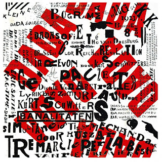
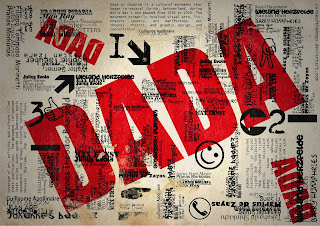
Dada was born out of negative reaction to the horrors of World War I. This international movement was begun by a group of artist and poets associated with the Cabaret Voltaire in Zurich. Dada rejected reason and logic, prizing nonsense, irrationality and intuition.this idea that art and music can be a form of protest world wide is something that really interests me. And i really believe that it effects the tone of art, for example their is lots of big bold red text repeating the word DADA, it really stands out from the rest of the mundane black and white foreground. I think that the very big and bright text is in the back ground because this was made to protest the war and the the black text is the media trying to cover over the Dada movement but its such a big and and spoken thing that the media cannot fully block their message.
This is some of the other Dada movement (inspired?), all following the same technique of having the very bold red text in the back ground and the black text overlaying it, to a point,
  |
| When I found this piece I immediately fell in love, And with further research I found that this is inspired by the artist "Jamie Reid" who is responsible for one of the sex pistols album covers, |
Jamie Reid
Reid is known primarily for the deployment of Situationist strategies in his iconic work for the Sex Pistols and Suburban Press.
Jammie Reid is very much a punk and you can tell from his work, its very messy or chaotic. I think he takes a lot of inspiration from dadaism because most of his work is protesting something, I particularly like his use of fonts, it looks like he's stripped a newspaper for its words and re arranged them so that they say his own message.
Neville Brody
during my research into Jammie Reid I discovered someone who took some inspiration from Reid. Neville Brody is an artist who shot into popularity around the 90's with his unique type face typography style of art I will make a more in-depth post about him because he so far is my favourite
Henri Cartier-Bresson
Henri Cartier-Bresson was born in 1908 and became the master of candid photography
Leading Lines
Henri cartier was famous for using leading lines in his photography. I illustrated above what I think he has done with leading lines using red lines to show where the lines are, he was also an almost completely black and white photographer. I think he used not only leading lines and depth of field to create focal points but lots of negative space to highlight his focal point(s)
Subscribe to:
Comments (Atom)


